The infinite sky’s deception aside (it’s not really blue, you know), blue is said to be the rarest color in nature. And when it does appear, it can be deadly: the Cerenkov effect is that eerie bluish glow generated by radioactive rods in the cooling pools of nuclear plants.
Click On:
- Hammock Carvings: Paul Baliker, Sculptor of Nature’s Balance at Man’s Mercy
- A Quartet’s Steely Encore at Hollingsworth, a Summer Sale at the Flagler County Art League
- An Eye for a Lens: Art League’s Photography Show Brings Out Simpler Pleasures
- Win Jones, Watercolorist of the Elusive and The Impish, at the Flagler County Art League
Paradoxically, blue is everywhere, and not only literally: it is the color of the imagination, of space, of deep water, of possibility, of too many brands and flags to count. There’s blue chip (for choice stocks), Big Blue (IBM’s nickname), “NYPD Blue,” blue jays, blue herons, blue laws (which, in the nation’s earlier days, forbade a citizen from kissing his wife on Sundays), blue days (in Alaska), the blues (in music), the blues (in the psyche), Saul Bellow’s “broad blue Wisconsin-humored sky,” Paul Bowles’s “peacock feather blue” off the north African coast, and Robert Frost’s discomfort at the infinite above: “And blue so far above us comes so high/It only gives our wish for blue a whet.”
Far down to earth, very far down, there are blue states (as opposed to red states), blue helmets (the United Nations’ much-maligned peace-keeping force), and there’s orange, said to be blue’s wife, or Nietzche’s weird belief that blue and green “dehumanize nature more than any color.” Translate Massachusetts from its Indian original and you get “blue mountains.”
The artist and writer Alexander Theroux, in “Blue,” one of three wonderful 1994 essays from The Primary Colors (the book is unfortunately out of print), tells us that blue is “the symbol of baby boys in America, mourning in Borneo, tribulation to the American Indian, and the direction South in Tibet.” And when Jack Benny held a contest for the best description of his blue eyes, the winner came up with this: “As blue as the thumb of an Arctic hitchhiker.” Incidentally, if a contest was held for the bluest eyes in Flagler County, the winner might be John Fischer, the school board member.
Blue’s rarity, in other words, like the sky’s color, is deceptive: the color demand attention. The Flagler County Art League is giving it with its newest show, Blue on Blue, opening tonight at the league’s gallery at City Market Place. It was a very wide-open invitation to artists, blue being the only thread—not just in color, but in concept. As the league’s Bob Ammon put it, blue could be the sky, and the sky’s the limit. Take it from there.
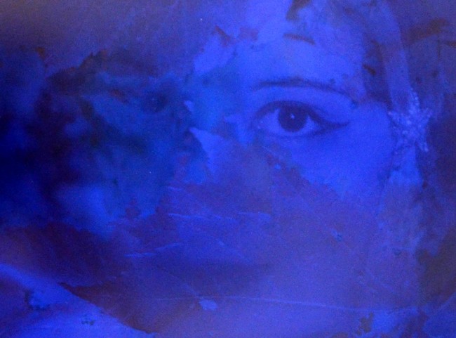
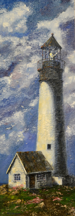
The artists did. The league got 90 entries—acrylics, mixed media, watercolors, photography, colored pencil, oils, sculpture—none, from what the eye could tell lacking at least a hint of blue, so the literal prevails, as does the figurative: blue rays, blue planet, blue lily pads, , blue waves, skies and clouds, , blue eyes, blue portraits and even a bluish lighthouse, which turned ouit to be the Best of Show: Richard Hausen’s “Tall lady.”

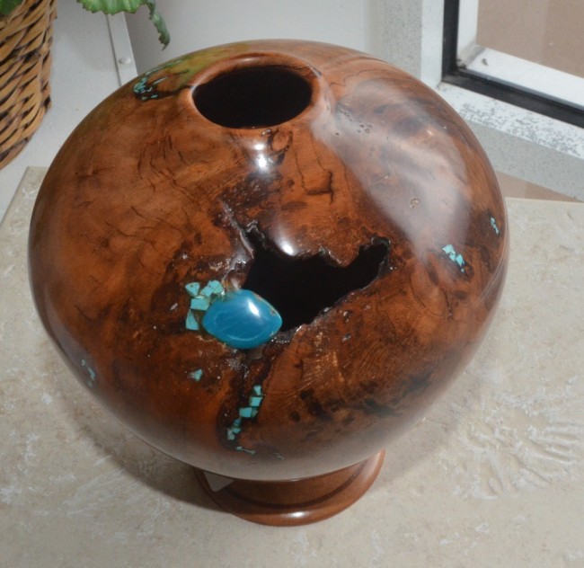
Karen Neville won first place for her “Under Water” acrylic, an oceanic painting that mixes color, time, perspective and context in imaginative and surprising ways, down to a toddler swimming in the deep with fish and coral, if not humanity’s deep-down origin. Second place went to “Mother Lode,” a sculpture by Rick Urban that combines the effect of a shattering gash in the elegance of a polished, almost spherical deep-brown vase, a few small turquoise stones cauterizing the piece into something you want to touch as much as it touches you. Third place went to Marty Martinez’s “Daytona Pier,” as literal a painting as you’ll see in this exhibit, juxtaposed with its twin, the Flagler Beach pier, for a reason: there’s a play in contrasts between Daytona’s slicker, more built-up pier and Flagler Beach’s still relatively virgin shore and woodwork, though the total emptiness of both—not a soul on pier or beach, not a fisherman in sight—makes the two paintings look like a scene from a post-nuclear event (assuming a neutron bomb was dropped in the area). Three seagulls flying in formation in the Flagler Beach painting suggests some life goes on. And the blue waters surrounding both piers look anything but lifeless.
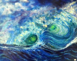
Blue waters are, not surprisingly, a recurring theme, the league’s artists being surrounded with it. Sally Van Witty’s 24 by 30 oil, “Double Eye,” creates the sort of frightful wave, alive, menacing and mean, that’ll make you think a few times before braving the waters again. The green of the wave’s twin eyes is an especially sinister touch that makes Nietzche’s not-so-weird belief after all: here the play between blue and green absolutely dehumanizes nature, in the sense of making it inhumanly perilous.

“Blue in almost any shade is also a fugitive paint,” Theroux wrote in his essay on blue, describing the color in ways that have a few distant echoes in the league’s exhibit. “(If you’ve ever owned a blue car, or blue jeans, you know what fugitive means.) It fades, maybe quicker than any other color. The destruction of the blue pigment on the lower part of the garment of Raphael’s Madonna, the Belle jardinière, is a good example. And it’s long been noted that no other part of the palette is so susceptible to distortion by the effects of age as the blues and violets.”
Keep that in mind as you walk around these 90-some works, which make a discovery of an ordinary color—and, one hopes, mark one in a series in the art league’s exploration of color. Last year the league devoted one of its shows to “Seeing Red.” Themed shows may be narrowing to some, kitschy to others, but when the theme is as simple and as broad as a color, possibilities—like colors—are endless. Throw the artists for a loop next year and have them deal with a secondary color. Meanwhile, here’s a month’s worth of what Wallace Stevens called “the pale intrusions into blue.”


Leave a Reply