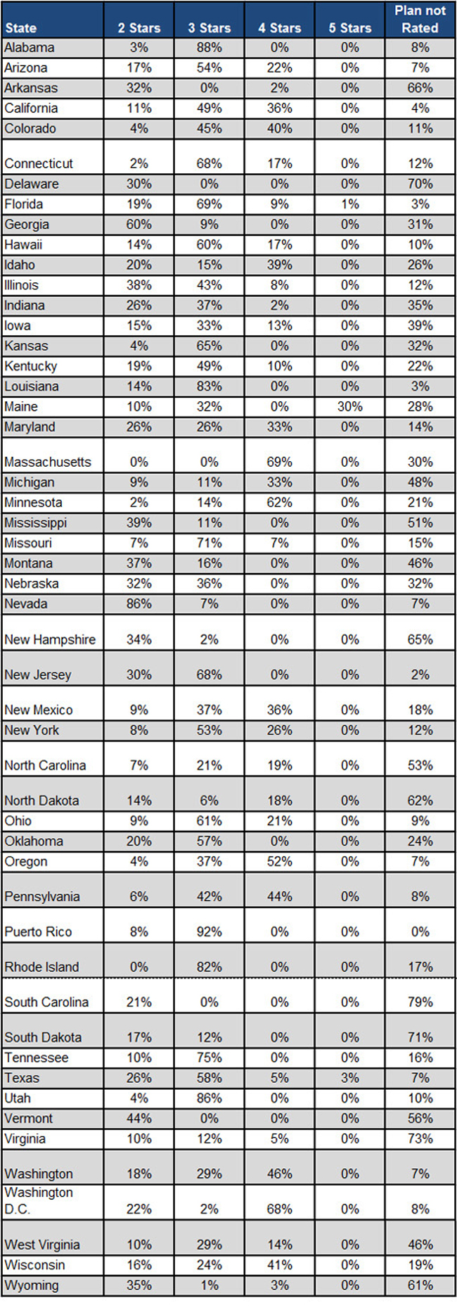
The following chart shows the percentage of Medicare Advantage beneficiaries enrolled in plans according to their rating. See the story here.

Source: Avalere Health via Kaiser Health News.
No Bull, no Fluff, No Smudges
The following chart shows the percentage of Medicare Advantage beneficiaries enrolled in plans according to their rating. See the story here.

Source: Avalere Health via Kaiser Health News.

This site uses Akismet to reduce spam. Learn how your comment data is processed.
Leave a Reply